One brand, two service modes
A shared grid and booking language hold the site together; pace and detail change to suit performance or clinical intent.
Never Quit Fitness, a private home gym in Melbourne, combines personal training with clinical exercise physiology. We gave both services a clear place in one visual system, then made the coach, studio and next step easy to find.
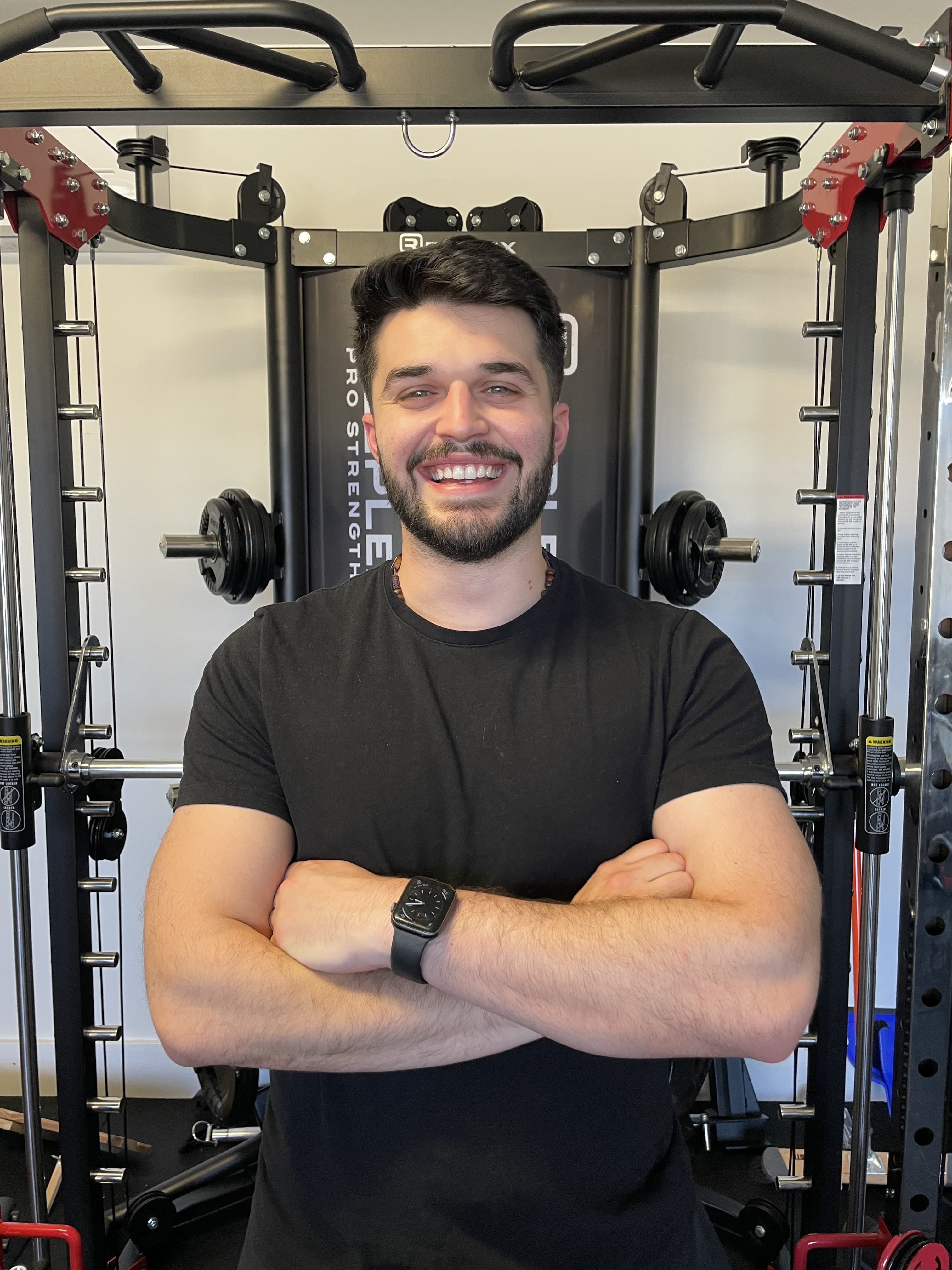 Real coach / real studio
Personal training can be fast, visual and goal-led. Exercise physiology needs more room for credentials, conditions and reassurance. Treating them identically would weaken both.
We designed one recognisable brand with two reading speeds. Bold navy and olive provide the continuity; page structure changes depending on what someone needs to understand before they are ready to act.
Switch the route below. This recreated fragment shows how the system changes emphasis without making the site feel like two unrelated businesses.
One shared component. Content hierarchy adapts to the decision.

The training route is direct and energetic, with the private studio, one-to-one format and measurable progress kept close to the booking decision.
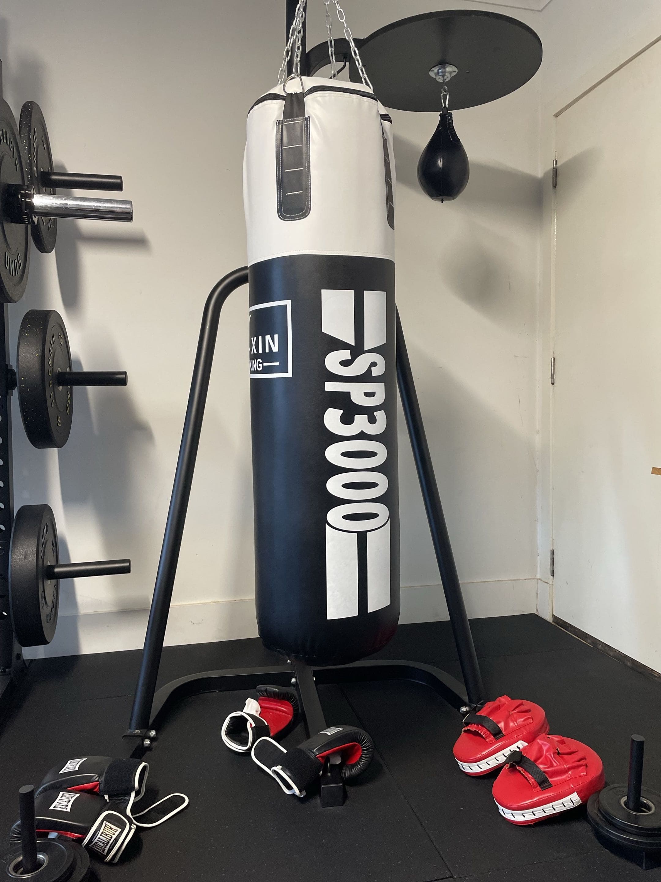
The supplied studio photos answer a practical question before a first visit: what is actually available in this private training space?
 01 / 04
Built as a reusable, touch-friendly media module rather than a row of identical feature cards.
We kept the visual identity strong, but stopped it from becoming a mask. The coach portrait, qualification and approach appear before long service claims, giving visitors a real person to assess.
Editorial ruleShow the practitioner. Name the qualification. Then explain the service.
We kept the site responsible for context and the calendar responsible for availability. No duplicate enquiry form, no hidden phone chase.
A shared grid and booking language hold the site together; pace and detail change to suit performance or clinical intent.
The supplied photos of Lucas, the private studio and its equipment answer practical questions without stock-fitness spectacle.
One action pattern carries from service comparison to calendar without turning every section into a sales pitch.
Service, equipment and qualification modules share rules, so future pages can grow without becoming new design problems.